Republic Wireless Site Refresh
Smart affordable communications the big guys can't deliver
I worked as a part of a cross-functional team whose goal was to improve the online shopping experience and customer experience at Republic Wireless: a low-cost cell service provider that is disrupting the telecom industry with its innovative software. This was a big effort to clean up the customer experience across the site into simplier and more cohesive shopping experience.
The goal of this redesign was to unify the brand message and to more clearly define the funnel to conversion for prospects. This project has a quick turnaround and involve main pages like: homepage, coverage, plans, shop, phones listing page, and a promotional content strategy.
Previous site homepage
Problem: Visitors to the Republic site enter and leave the site from various endpoints- without a clear path in their shopping experience. The lack of a cohesive marketing strategy has resulted in a splintered shopping experience using complex, technical language, and over abundance of CTAs, and lack of focus in the IA.
Solution: Align the site with a clear linear path that aligns more closely with the online shopping experience- check coverage, learn about cell phone plan options, and buy a phone. One-thing-at-a-time strategy applied throughout the site
Outcome: Clearly defined shopping path, simple navigation, reduced branching paths for users while optimizing it for the mobile experience. Increased sales and comprehension of services through refined ux, content, and branding strategy.
Role: lead UX strategist and researcher, IA. Collaborated with marketing designers and researcher, and dev ui team.
research and mapping User journeys
Storyframing is an important process in this user journey research, and a great way to apply our target segments to our designs. If we design for a specific flow, we can ensure a smooth purchase process.
Because buying a phone is something that takes time, it’s important to include ways for shoppers to jump back in. We can save their items in the cart, or show view history for returning visitors.
New Information architecture
Mimic user shopping experience- learn and then buy a new phone. The goal was to make the path clear to users while reducing branching paths in the navigation structure, killing marketing pages that no longer served the brand message
mobile first strategy
Our mobile traffic has increased over years to outpace desktop traffic, so it became essential to keep the mobile views of the site clean, clear, and simple.
User interviews
Throughout the whole process I lead and coordinated hours of user testing, from in-house Guerrilla usability testing , Think-out-louds, and moderated video interviews. Several rounds of usability testing were conducted with a total of 20+ users; each round resulted in the modification of the visual design based on user feedback.
Promotional content strategy + template
I worked with our marketing director to come up with template for showing phone and service promotion that added value to the pages without distracting from the main page content. I came up with a system to show different kinds of phone information like: new, out-of-stock, low-inventory, discounted promotions, and unavailable states.
New page: Shop
In an effort to keep a simple navigation we created a shop page to house our main products- that being our smartphones, and sim card kits. This page serves as a launching pad to view our products while promote sales and announce new phones.
New: Plans Page
The goal of this page was to drive awareness of the new monthly plans (how they work, the control/flexibility they allow the user). The secondary function of this page to was encourage/drive conversion for prospects, who understand this as the best deal in wireless.
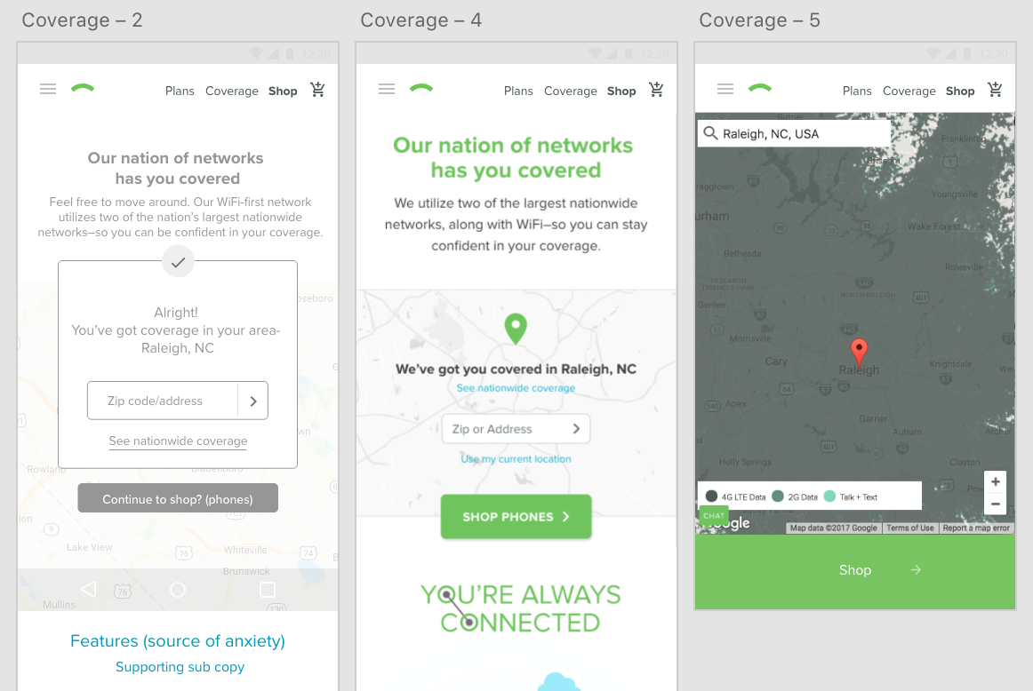
New: Coverage Page
Integrate coverage map while also build confidence that we have users covered. Passive check of coverage through IP address.
Check out the live site
Learnings
The site redesign was effective in influencing users to move through our desired flow of pages: The percentage of visitors viewing Homepage > Plans > Coverage > Phones increased from 1.7% pre-redesign to 17.7% post-redesign. This was true for First-Time visitors, Prospects, and even Members (Identified & Logged In) - which attests to the influence of the top navigation.
It is hard to attribute conversion with this new flow- but it did force us to revisit our site strategy, being cohesion in message, communications, and optimize for the user shopping journey. This greased the wheels for us to make smart and swifter decisions forward- in the form of A/B testing, content strategy, and iterative branding work .
See the site here


